Classic Neg. or Nostalgic Neg.? If you shoot Fujifilm, you've probably asked yourself that question. Both are among the most loved film simulations, and on a small phone screen they look surprisingly alike: a bit warm, a bit analog, like a printed photo. But once you shoot with them for a while, you notice they feel completely different. One is punchy and a little gritty, the other is soft and golden.
This post is the long version of a carousel I shared on Instagram. To make the difference easy to see, every comparison here is the same RAW file from my Fujifilm X-H2S, converted twice: once with my Rusty recipe, which is built on Classic Neg., and once with the Falling Leaves recipe, which is built on Nostalgic Neg. Same place, same light, same moment.
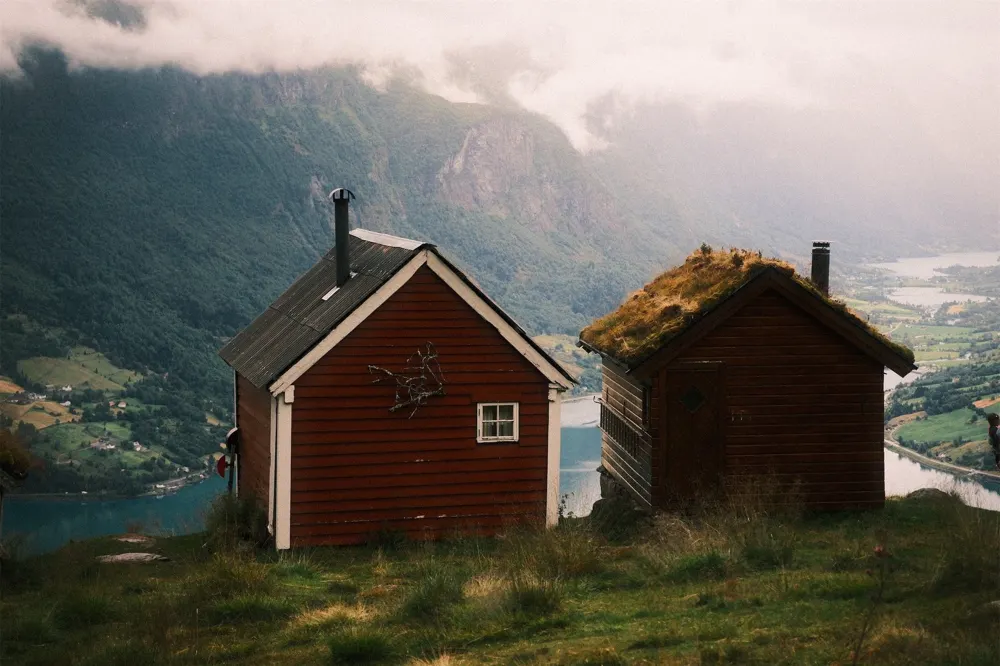
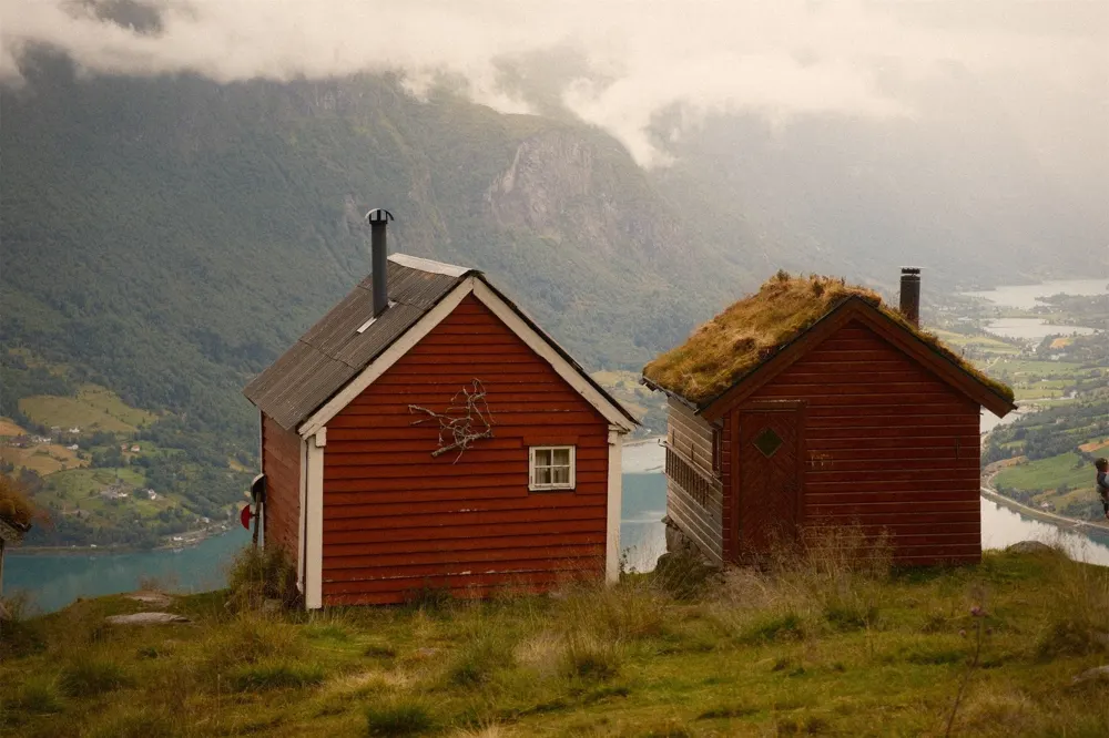
One honest note before we start: a recipe adds its own seasoning on top of the film simulation, like a warmer white balance or more grain. So this isn't a lab test of the bare simulations. But both recipes push in the same direction as their base, so the character of each one comes through clearly.
New to Film Simulations?
Fujifilm made photo film for decades, and its digital cameras can imitate the look of those films. Fujifilm calls these looks film simulations. A recipe is a film simulation plus a handful of extra settings, saved in the camera, so every photo comes out finished without editing. If that's new to you, start with What Is a Fujifilm Recipe?, where I explain it from scratch.
Classic Neg.: The Everyday Snapshot Film
Classic Neg. (short for Classic Negative) arrived in 2019 with the X-Pro3. It's modelled on Fujicolor Superia, the colour negative film people used for everyday snapshots, the kind of photos that ended up in family albums.
Consumer film like that often sat in a camera for months, and its colours drifted. Fujifilm built exactly that into the simulation: the shadows lean towards cyan green and the highlights lean towards magenta. Together with hard contrast, that colour split is what makes Classic Neg. look like film. It stays colourful even in the midtones and feels a little unbalanced and lo-fi, in the best way.
- Contrast: higher, with harder shadows.
- Shadows: lean cyan green.
- Highlights: lean magenta.
- Overall feel: punchy and a bit gritty, like a snapshot from the corner shop photo lab.
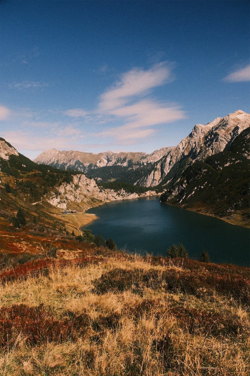
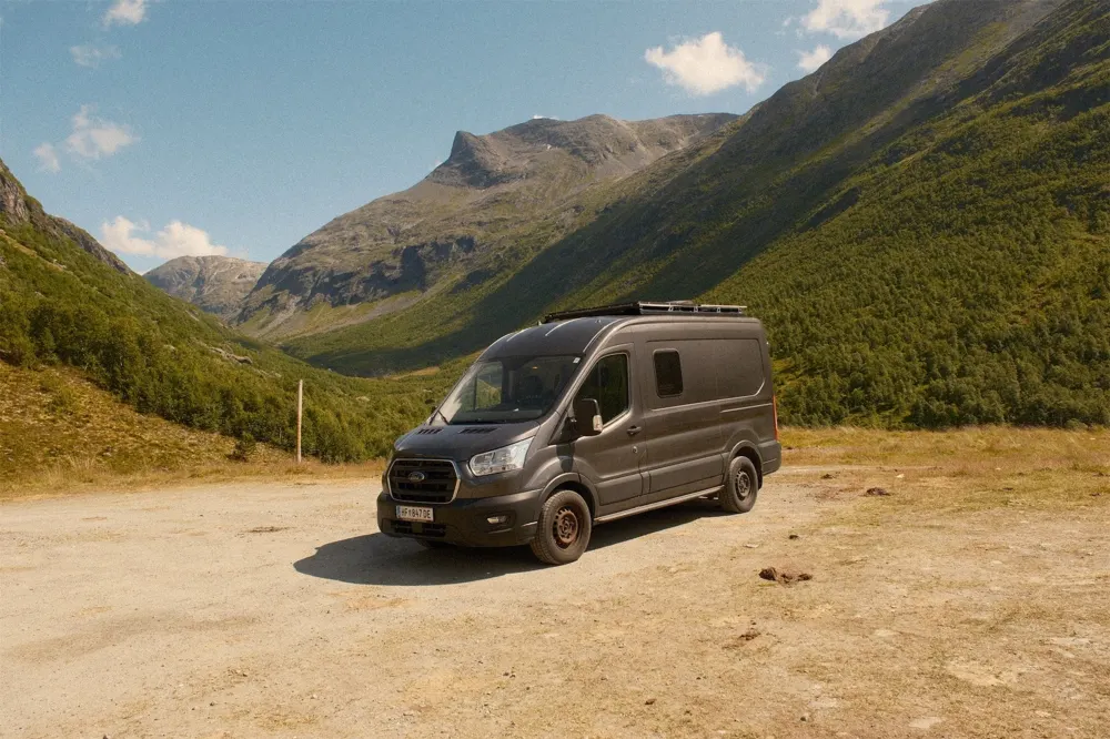
In practice, Classic Neg. pulls colours apart. Blues lean cyan, warm tones get a rusty edge and the whole scene looks punchier. On the mountain lake below, look at how the cool water and sky separate from the warm rock.
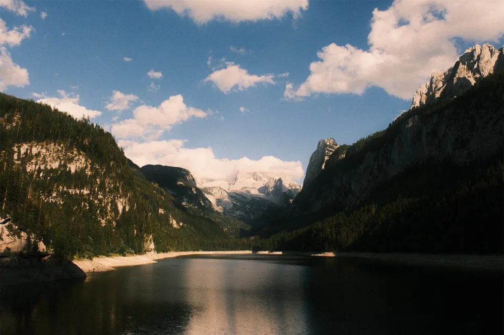
My Rusty recipe adds a warm white balance shift on top (+5 Red, −5 Blue), which pushes the bright parts towards rust and orange, while the deep shadows stay close to black. That's why it shines in low, warm afternoon light.
Nostalgic Neg.: The Warm, Golden Print
Nostalgic Neg. first appeared in 2021 on the GFX100S and came to the X Series in 2022 with the X-H2S. It's inspired by the New American Color movement: photographers who switched from black and white to colour and captured everyday life in warm, saturated prints, a look that still shapes photography, fashion and film today.
In most photos, shadows sink into blue or green. Nostalgic Neg. does the opposite and adds amber. The highlights glow warm, the contrast is softer and the shadows keep plenty of detail. You can't really fake this with white balance: a warmer white balance tints the whole frame, while Nostalgic Neg. puts the amber where the light is.
- Contrast: softer.
- Highlights: warm amber.
- Shadows: rich, with lots of detail.
- Overall feel: warm, soft and a little dreamy, like an old print from a shoebox.
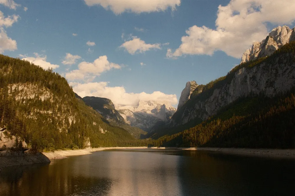
Here's the same mountain lake again. Everything gets warmer and softer, the highlights glow amber, the shadows stay open and the scene feels like an old print.
Side by Side
This is where the difference really shows. In each pair, the left photo is Rusty on Classic Neg., the right one is Falling Leaves on Nostalgic Neg.
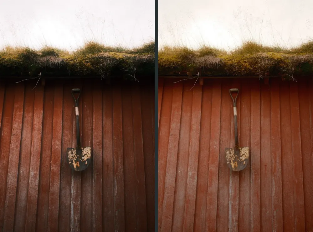
On an old red wall, Classic Neg. keeps the red deep, the texture hard and the corners dark. Nostalgic Neg. lifts the whole wall into a lighter, more orange red and softens every edge.
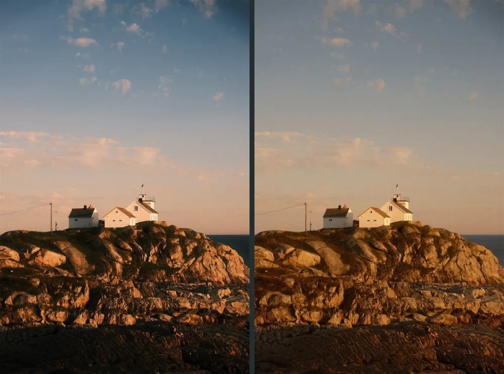
Look at the sky and the rocks. Classic Neg. keeps them cool and crisp, Nostalgic Neg. turns everything golden.
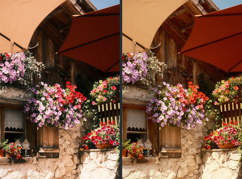
The reds tell the story. Punchy and crisp on the left, softer and warmer on the right, where the red flowers drift towards orange and the pinks turn lavender.


Same kayak, same evening light. Classic Neg. turns the mountains almost black and keeps the water cool. Nostalgic Neg. opens up the shadows and wraps everything in a warm haze, like a summer memory.
So When Do You Use Which?
- Want contrast and grit? Classic Neg.
- Want warmth and softness? Nostalgic Neg.
- Flat, grey day? Classic Neg. Its contrast and colour split bring life into dull light.
- Golden hour and autumn? Nostalgic Neg. The amber highlights make warm light glow.
- Streets and cities? Classic Neg. It loves concrete, signs and texture.
- People? Nostalgic Neg. Skin tones stay warm and rich, even in the shade.
These are tendencies, not rules. A recipe can push a film simulation somewhere it wouldn't go on its own. Rusty, for example, is a Classic Neg. recipe that I love in low afternoon sun, and on a grey day I'd rather pick a gentler Classic Neg. recipe like Soft Rust.
Which Cameras Have Them?
- Classic Neg.: since 2019, starting with the X-Pro3. Also on the X100V, X-T4, X-S10, X-E4, X-T30 II and every newer X Series camera. The X-T3 and X-T30 don't have it.
- Nostalgic Neg.: on X Series cameras since 2022, starting with the X-H2S, for example the X-H2, X-T5, X-S20 and X100VI. Older bodies like the X-T4 or X100V don't have it.

If your camera only has one of them, that's your answer. If it has both, save one recipe of each and switch depending on the light.
The Two Recipes
Here are both recipes, so you can try them yourself.
Rusty (Classic Neg.)
- Film simulation: Classic Negative
- Dynamic range: DR400
- White balance: Auto, +5 Red, −5 Blue
- Highlight −2, Shadow +3
- Color +4
- Color Chrome Effect Strong, FX Blue Strong
- Grain Weak, Large
- Sharpness 0, High ISO NR −3, Clarity −4
- ISO Auto up to 6400, exposure compensation 0 to +1
Every setting explained, with ten photos straight out of camera: Rusty.
Falling Leaves (Nostalgic Neg.)
- Film simulation: Nostalgic Neg.
- Dynamic range: DR100
- White balance: Auto, +6 Red, −6 Blue
- Highlight −1.5, Shadow 0
- Color 0
- Color Chrome Effect Strong, FX Blue Weak
- Grain Strong, Large
- Sharpness −2, High ISO NR −4, Clarity −2
- ISO Auto, exposure compensation +1/3 to +2/3
Your Turn
So, which one is yours: Classic Neg. or Nostalgic Neg.? Tell me on Instagram at @danieljschwarz, where I post new comparisons and recipes first. And if you want more looks to try, all my recipes are on danieljschwarz.com/recipes.